About Worqx
HTML 5 & CSS
This revision of worqx.com was designed to make use of the techniques of Responsive Web design and be both usable and accessible across device platforms. It uses valid HTML 5 and CSS for presentation & layout, and media queries to respond to the screen size of a user's device.
The site uses five separate style sheets for the screen widths of mobile phone in portrait or landscape mode, a tablet in portrait or landscape, and one for a desktop with a higher resolution.
Overall it is a pretty straight-forward layout with left and right colums and a main content area. As the screen width decreases, the layout reforms until all content is displayed in a single full width column.
Various Screen Widths
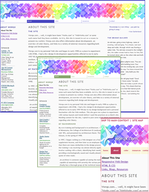
To see it resize, (In Firefox, Chrome or Safari) just manually increase or decrease your browser window width.
ADVERTISEMENT
And Those Little Things...
To get it to display correctly in older versions of Internet Explorer, you will need to add a conditional comment as those browsers dont understand the HTML 5 elements:
<!--[if lt IE 9]>
<script>
document.createElement('header');
document.createElement('nav');
document.createElement('section');
document.createElement('article');
document.createElement('aside');
document.createElement('footer');
</script>
<![endif]-->
<!--[if lt IE 9]>
<link rel="stylesheet" type="text/css" media="screen" href="css/ie.css" />
<![endif]-->
I included the viewport meta information, but to get it to resize correctly with the pinch actions on an iPhone/iPad I needed to specifiy a maximum scale:
<meta name="viewport" content="width=device-width, maximum-scale=3.0, minimum-scale=1.0, initial-scale=1, user-scalable=yes">
If you're interested in Responsive Web design, investigate the links listed on the Links, blogs & Resources page.